
Upflowy is a SaaS platform that empowers teams to create, test, and optimise onboarding flows and sign-up forms without the need for code. During my time working with the company, I contributed to two key initiatives: improving the UX/UI of the platform’s settings, and resolving an inconsistency on editing patterns to ensure a more intuitive and consistent user experience across the product.
Split Settings UX Enhancement
I helped the user to have a clearer understanding of the Split Settings options with simple previews. By providing a visual representation of the different settings, I made it easier for them to grasp the concept of how the options would affect the overall output.
01.Overview
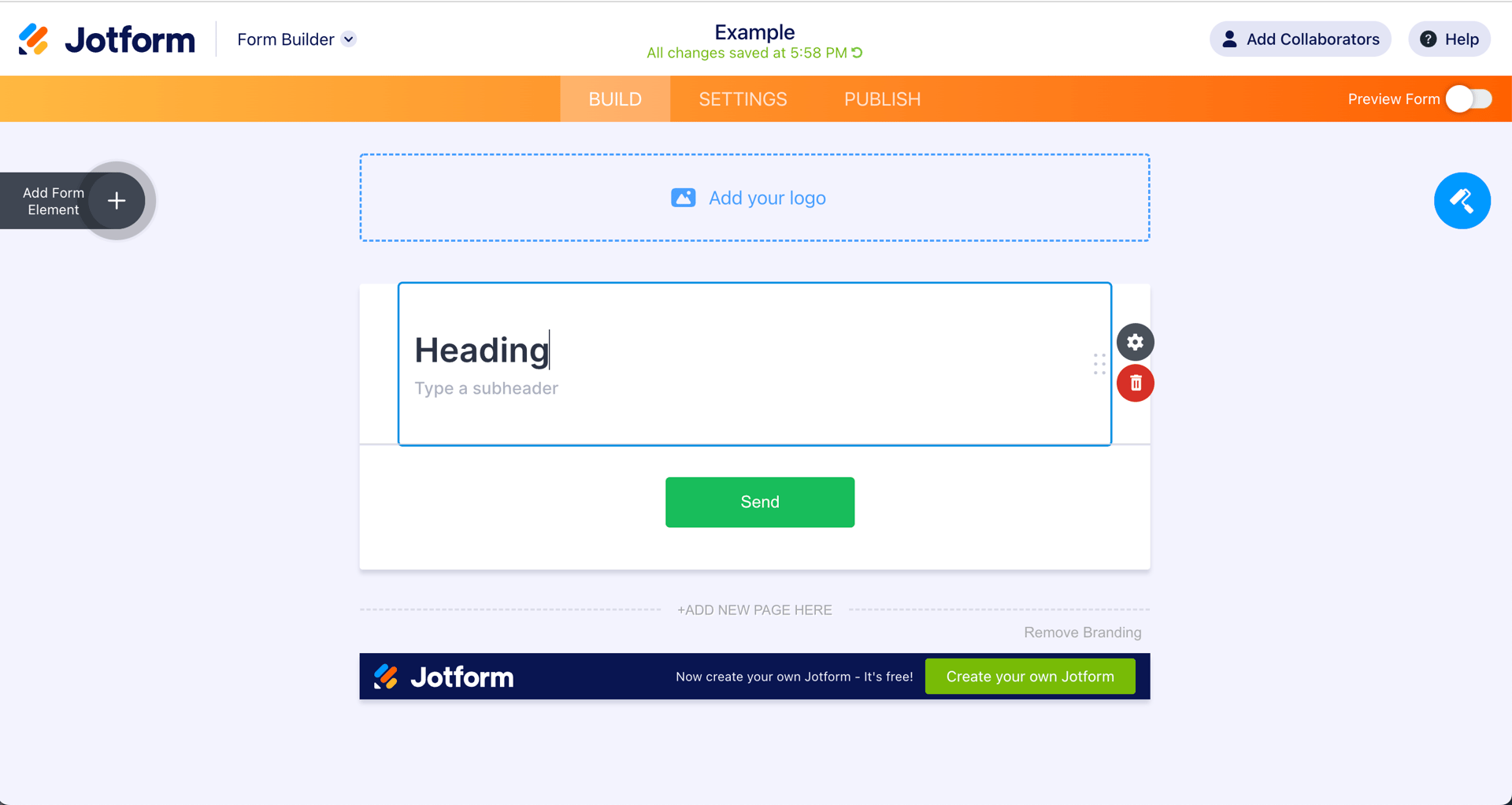
The goal of this project was to improve the platform’s settings interface, specifically the “Split Settings” feature, which was not intuitive for users. Many struggled to understand the logic behind the settings and how they affected their onboarding flows.

02. Problem
The existing design presented the split logic in a way that was difficult to interpret, often leading to misconfigurations. This caused inefficiencies and frustration, particularly for new users unfamiliar with the feature.
03.Design Process
I analysed user behaviour and feedback to identify points of confusion. From there, I developed wireframes and prototypes introducing visual previews and clear labels to help users better understand the consequences of their choices. I iterated these designs based on stakeholder and internal feedback to ensure both clarity and functionality.
04. Solution
Visual tools to make it clearer
With illustrations the options are much clearer for the user, instantly depicting in a simple way what will happen once they choose a split option.

05. Improvement
Adding animations for flawless understanding
While thinking of possible ways to help the user understand the options, I came up with the idea of animating the illustrations when the user hovers over each button. It’s a dynamic way of portraying the previously static information, erasing all possible confusions for the user.
Resolving an Inconsistency on Editing Patterns
There’s an inconsistency between the editing patterns of text components and the other components that is creating confusion among the users.
01.Overview
This initiative focused on addressing an inconsistency between different editing patterns within the platform. Users encountered two different interaction models for similar editing tasks, leading to confusion and slowing down their workflow.

02. Problem
The inconsistency created a fragmented experience. Depending on where users were in the platform, they had to adapt to different editing behaviours, which was not only inefficient but also broke the expected patterns of interaction.
Text components
Every text component can only be change in the step view where you can also find the editing toolbar.

03.Process
I reviewed the existing editing flows and mapped out both patterns side-by-side. Working with product and development teams, we assessed the technical feasibility of aligning these interactions and identified the most intuitive approach based on established UX principles.
User Journey
I mapped out the current user steps to see which are the pain points and how I could simplify the journey to help the users edit the components in the most intuitive way possible.
Research
I mapped out the current user steps to see which are the pain points and how I could simplify the journey to help the users edit the components in the most intuitive way possible.


04.Solution & Results
A unified editing pattern was implemented across relevant areas of the platform. This ensured a consistent user experience, reduced cognitive load, and improved overall usability. By standardising interactions, users could work more efficiently and confidently.
Concept 1: Edit text in the toolbox
I disabled the inline editing option, leaving the left-side toolbox as the only editing area.
Concept 2: Edit text in step view
I enabled the inline editing for every component, without removing the left-side toolbox option for the other components.
Prototype
The main focus of my involvement with this task was to assess the user experience and provide a real prototype.